Aspects
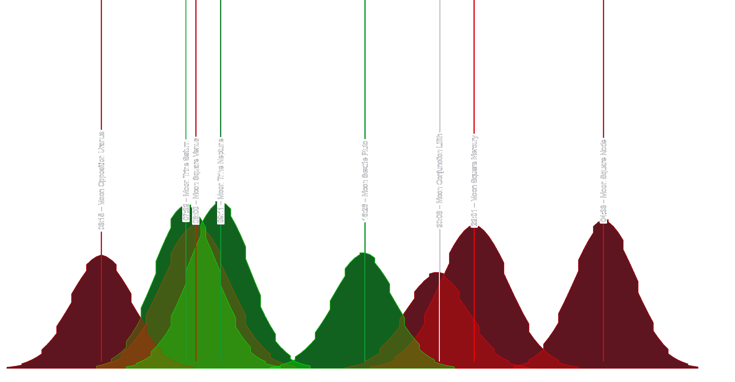
Aspects are the chart’s timing spine — the “when”. They mark the exact moments when two bodies form a notable angular relationship. On the chart, you’ll see them as vertical markers (each marker = a specific timestamp).
What an aspect actually is
The zodiac is a 360° circle. Each body has a position on that circle, and an aspect is simply the angle between two positions.
Quick example: Planet A at 10° Aries and Planet B at 10° Cancer. Aries starts at 0° and Cancer starts at 90°, so those positions are 10° and 100° on the wheel — that’s 90° apart, which is a Square.
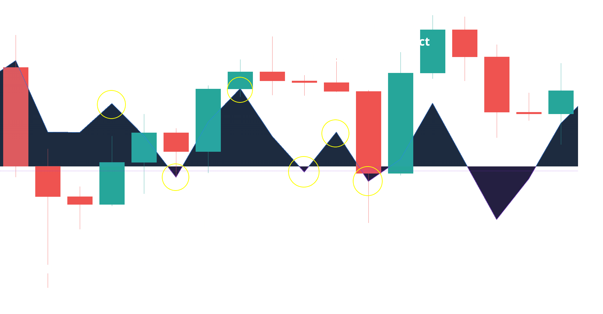
Peak point = the exact alignment
Every aspect has a peak point — the moment of exact alignment. Think of it like a pressure wave: energy builds into the peak and fades after.
- Into the peak: watch for “pressure building” behavior (trend exhaustion, compression, volatility expansion, stop-runs/liquidity grabs).
- At/near the peak: look for confirmation with normal technical tools (structure, volume, RSI/MACD divergence, rejection candles, break/retest).
- After the peak: the market often “hands over” to whatever the underlying forces are (trend continuation resumes, or a reversal follows through). Let price confirm which one won.
Market tone by aspect type
- Favorable aspects: Trines (120°) and Sextiles (60°) tend to feel smoother and more supportive — often read as a bullish tailwind for markets.
- Challenging aspects: Squares (90°) and Oppositions (180°) tend to feel tense and reactive — often read as bearish / risk-off pressure.
- Conjunctions (0°): feel like amplification — two themes merge into one louder signal. The “good/bad” depends on the specific pairing and context, so treat it as volume turned up, not a guaranteed direction.
Major aspects (the core set)
- Conjunction (0°): blend + amplify (planets together).
- Opposition (180°): polarity + tension (push/pull).
- Square (90°): friction + challenge (pressure point).
- Trine (120°): ease + harmony (flow).
- Sextile (60°): opportunity + cooperation (helpful opening).
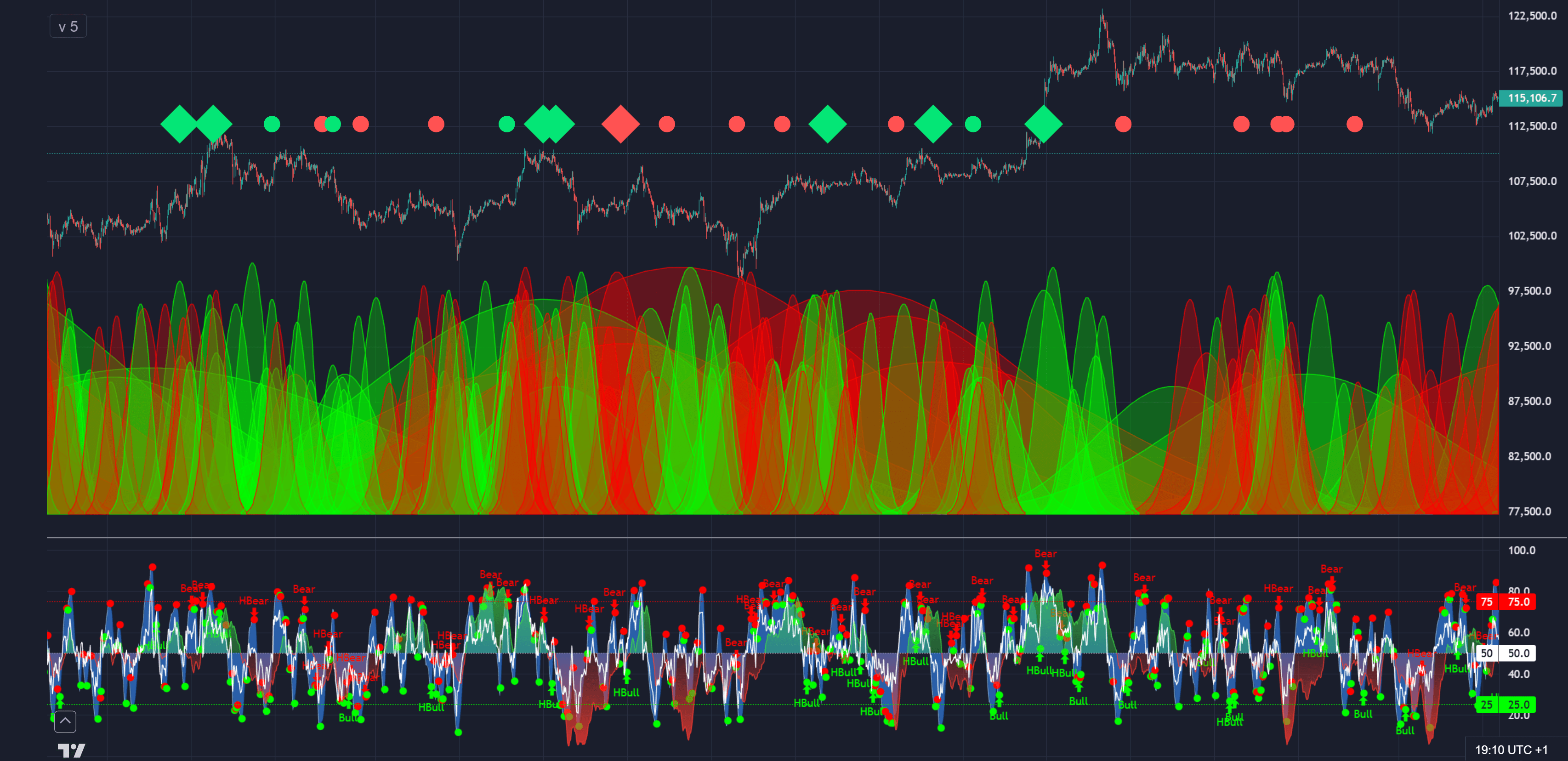
AstroWaves
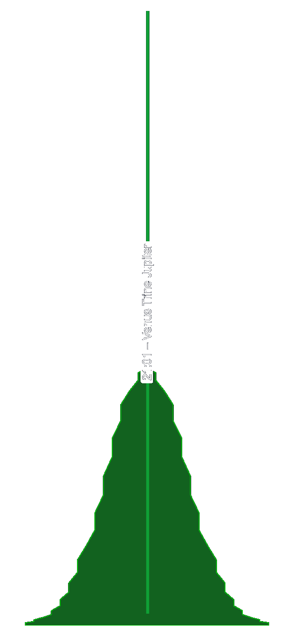
Bellcurves (often experienced as “Astro Waves”) answer a different question than Aspects: how long does an influence matter, and how intense is it around the peak?
How it works (in trader terms)
Instead of showing only a single timestamp, bellcurves visualize an event as a smooth “influence hill” that rises toward the exact moment and fades afterward. You’re not reading math — you’re reading shape:
- Wider curve → longer-lasting “weather system.”
- Narrow curve → quick impulse / short-lived reaction.
- Taller curve → stronger presence relative to others on screen.
- Clusters → multiple influences stacking into a bigger window.
What to look for
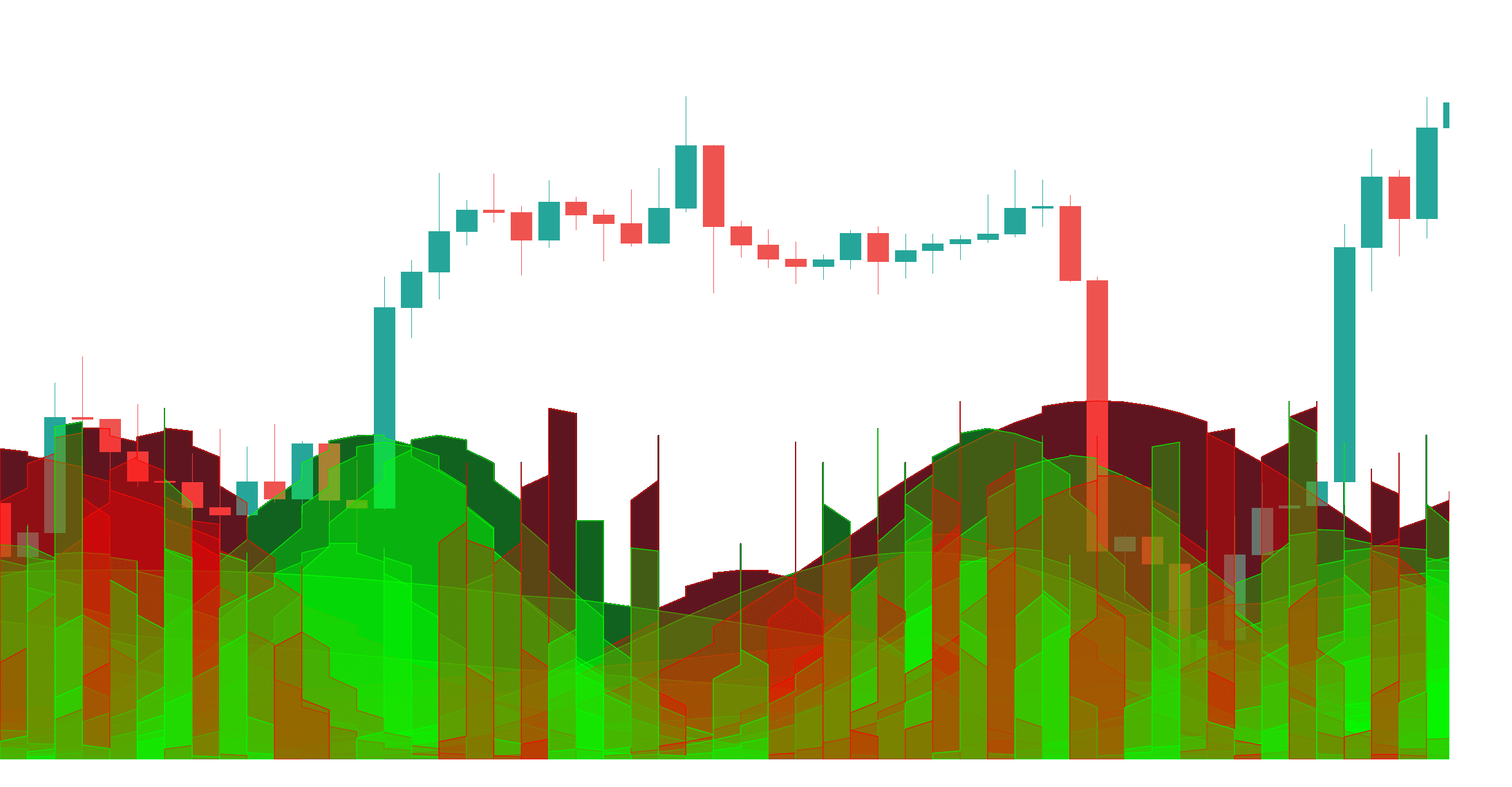
- Overlap (“confluence zones”): when several curves peak in the same area, expect movement to be more meaningful.
- Curve shift vs price structure: if a strong zone lands near key support/resistance, it often becomes a “decision arena.”
- Mismatch: a big curve during a dead, sideways market can signal that volatility is being stored rather than expressed… yet.
How to use Bellcurves
- Pick a timeframe and zoom to alùXïûC#? (high/low, breakout range, trend leg).
- Identify the next 1–3 high-intensity zones (wide/tall overlaps).
- Use the oscillator to decide whether you’re in a “push” phase or “fade” phase.
- Plan entries/exits around those zones — not because they guarantee direction, but because they increase the probability of meaningful reactions.
Example pattern: a long, wide curve zone spans multiple candles while price forms a tightening range — breakouts from that range often happen inside the zone, not randomly.
AstroOscillator
The oscillator is the “summary layer.” Instead of reading many individual events, you get a single flowing line that reflects the market’s overall astro “push” vs “pull” over time.
What it does
- Helps you see directional bias (rising vs falling flow).
- Highlights momentum shifts (peaks, troughs, and turns).
- Makes confluence easier: you can quickly check whether a timing window is supported by the bigger flow.
How it works (visually)
You’ll typically see a midline (zero) with the oscillator expanding above/below it. Think of it like a tide chart:
- Above the midline: supportive flow / tailwind conditions are more common.
- Below the midline: heavy flow / headwind conditions are more common.
- Turns: the slope changing direction often matters more than the exact value.
What to look for / how to use
- Midline crosses: useful for “regime shift” reads — especially if they align with aspects/ingresses windows.
- Peaks & troughs: a peak into resistance often signals exhaustion risk; a trough into support often signals rebound risk.
- Acceleration: when slope steepens and bellcurves overlap, moves tend to extend.
- Fade zones: when oscillator flattens while price keeps pushing, that divergence often precedes chop or reversal.
Example pattern: oscillator bottoms, then turns up while price is still basing — that’s often an early “pressure release” warning before the visible breakout.
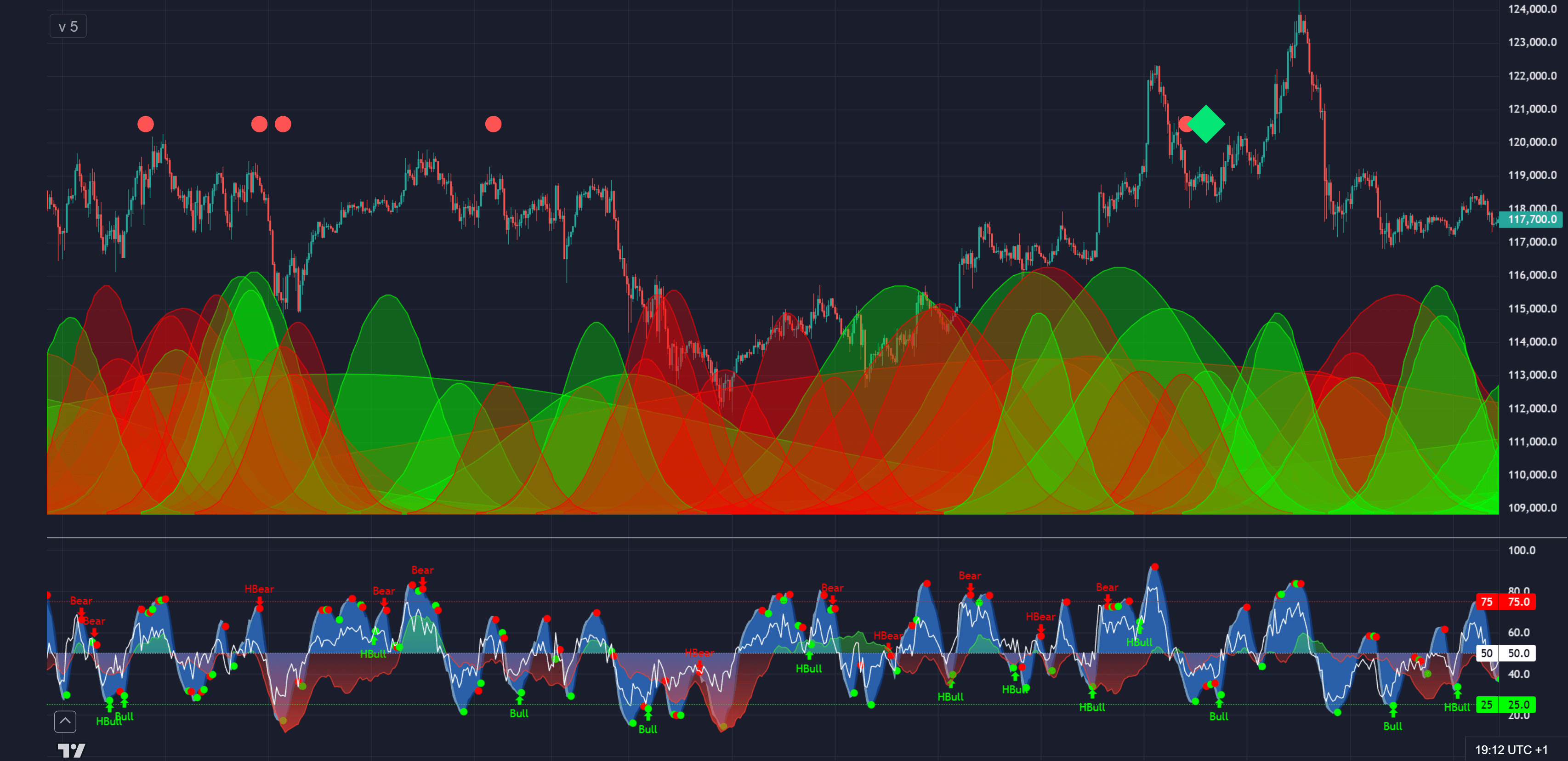
AstroSignals
Signals are the “attention magnets.” They don’t replace analysis — they reduce missed opportunities by visually flagging moments that have historically aligned with meaningful reactions.
What it does
- Places clear icons on the chart at notable astro moments.
- Helps you scan fast: “Do I need to pay attention here?”
- Works best when combined with bellcurves + oscillator rather than used alone.
How to use (practical rules)
- Don’t treat icons as buy/sell buttons. Treat them as “check the chart now.”
- Trade with structure: only act if price is at a level you already care about (range edge, support/resistance, breakout/retest).
- Use flow as a filter: if oscillator is rising, prioritize long setups; if falling, prioritize short/defensive setups.
- Use bellcurves for context: icons inside high-intensity overlap windows are more “important” than isolated icons in quiet periods.
Common ways traders use signals
- Patience tool: “I will not force trades until a signal window is near.”
- Exit helper: if you’re in profit and a risk-type signal window appears into resistance, you tighten stops or scale out.
- Volatility warning: helps you avoid entering late right before a spike/reversal window.
Example pattern: signals cluster near the end of a trend leg while oscillator is flattening — that combination often marks the transition from trend to range.
Astro Ingresses
Ingresses are the “chapter markers.” While aspects often feel like moments, ingresses often feel like the start of a new phase — a shift in background conditions.
What it does
- Marks when a body enters a new zodiac sign.
- Marks retrograde and direct station points.
- Includes major lunar events like new/full moons and eclipses when shown in your feed.
How to use (in trading workflow)
- Regime awareness: treat ingresses like “market season changes.” They often coincide with shifts in volatility and narrative.
- Planning tool: when you see a major ingress coming, you don’t need prediction — you need preparation (levels, scenarios, risk).
- Retrograde lanes: use the highlighted retrograde periods as “expect re-tests, delays, reversals, and messy structure” windows — then confirm with price.
- Lunar events: great for timing; best used with oscillator slope and nearby aspect clusters.
Example pattern: a retrograde station appears as price is extended — you’ll often see chop, pullback, or failed continuation soon after (especially if signals also fire).